Yi-Hong Chang, Tyng-Ruey Chuang
Institute of Information Science
Academia Sinica
Nankang, Taipei 115, Taiwan
{yhchang, trc}@iis.sinica.edu.tw
Phone: +886 2 2788-3799 ext. 1608, 1661
Fax: +886 2 2782-4814
June 2002
Keywords: Data Visualization, Online Aggregation, Population Statistics and Mapping, SVG, Web, XML.
Abstract
Standards like XML and SVG allow data to be exchanged between systems while maintaining its semantic integrity. Free software tools (Apache web server, Mozilla web browser, etc.) provide the means to build and maintain systems for data exchange. We report our experience in integrating free software tools for online aggregation and visualization of large census datasets. The system, Taiwan Social Map, is a Web-based system with XML, and SVG in particular, as the basis for data representation and visualization. Our experience in building the system has been very encouraging. We report in this paper the approaches we took, the lessons we learned, as well as the challenges we may continue to face in building and extending the system. Special efforts have been made to generate SVG data graphics that are clear, concise, interactive, and portable.
This project, Taiwan Social Map, aims to use XML, and SVG [1] in particular, as the basis of a Web-based population mapping system. Only freely available software tools are used in building the system. Hence, this project also functions as a benchmark for the evaluation of freely available XML processing tools. The major data sources used in the current system are the 1990 Taiwan census dataset, which includes 19,974,329 de-identified personal surveys, and a detailed administration district map of Taiwan, which consists of the locations and contours of all the 7,738 precincts and villages in Taiwan.
Our experience in building the system has been very encouraging. We report in this paper the approaches we took, the lessons we learned, as well as the challenges we may continue to face in building and extending the system. This paper is organized as the following. In Section 2, we provide background information about the datasets we used. Section 3 shows a scenario of using the system, and Section 4 gives an overview of the major system components. Section 5 describes designs of the data graphics. Section 6 is about the lessons we learned and the challenges we face. Section 7 talks about related and future work, and Section 8 concludes.
Taiwan Household and Residence Censuses were conducted 7 times, in 1956, 1966, 1970, 1975, 1980, 1990, and 2000. During each survey, every household in Taiwan was interviewed for its household composition (household size, personal data for each household member, etc.) and residence status (residence size, rented or owned residence, etc.). The 1990 dataset includes 19,974,329 records of de-identified survey results, with one record for each surveyed individual. Each record contains 31 personal attributes, ranging from the individual's gender, year-of-birth, marital status, education level, to the individual's residence area code.
The residence area code is an 8-digit numeric code used only for conducting the census. However, this residence code can be uniquely mapped to an administration district code used for local governance. Taiwan has a three-level local government system. At the upper level, Taiwan consists of 18 counties and 7 (big) cities. At the middle level, a county is composed of several (small) cities, towns, or countries, and a (big) city is composed of several districts. At the lower level, there are villages, which make up countries, and precincts, which make up (small) cities, towns, and districts. In total, there are 25 upper-level local governments (big cities and counties), 319 middle-level local governments (district, small city, town, country), and 7,738 lower-level local governments (precincts and villages). Each precinct and village has a population in range of about 100 to 10,000. All local government chiefs are elected by popular votes. The only exception are district chiefs, who are delegates of (big) city mayors.
An Administration District Map of Taiwan, in ArcView format [2] and containing the locations and contours of all the precincts and villages in Taiwan, was previously built by the Computer Centre of Academia Sinica, and has been used in other research projects. The 1990 census data, when collated with the administration district map, thus becomes a rich source of detailed population profiles of Taiwan in 1990. Our goal is to use open standards and free tools to build a Web-based system to help map and explore this rich source of population data.
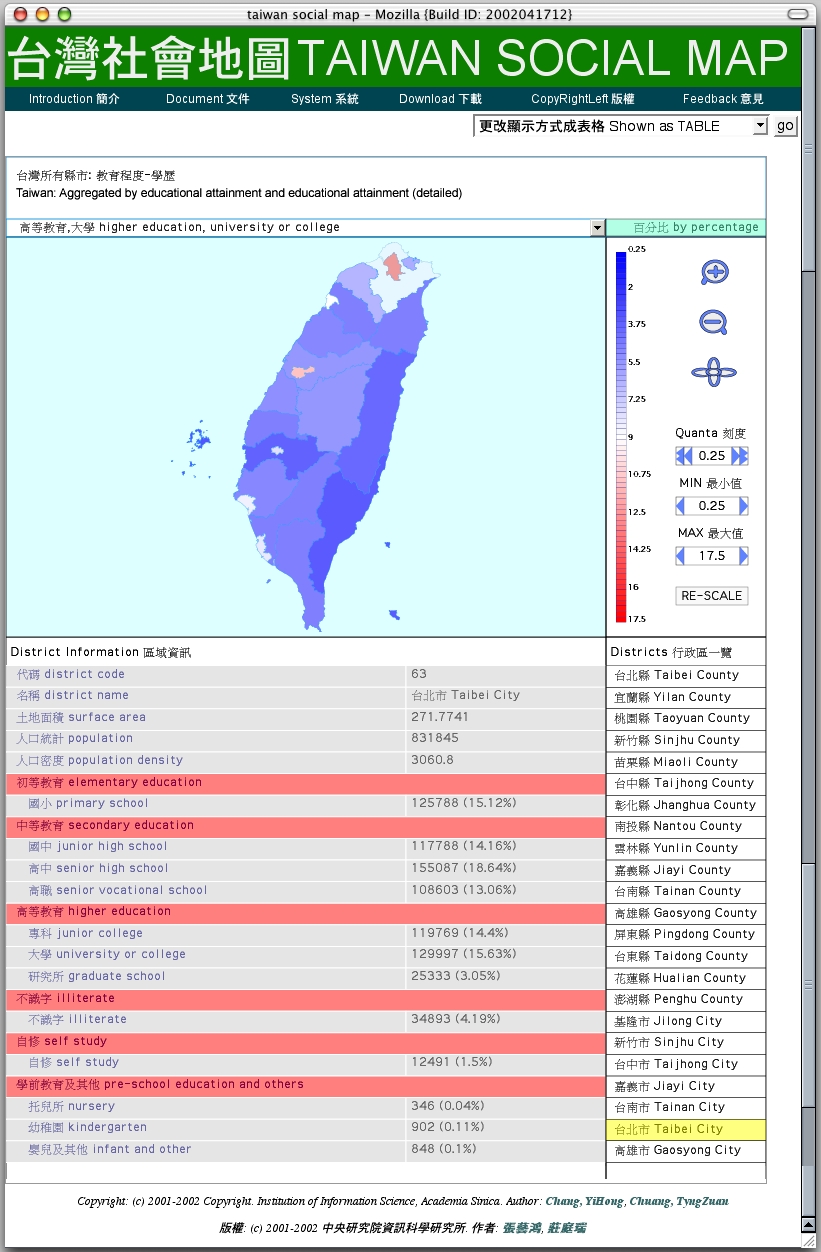
Figure A is a screen shot of a population map in a user's browser. Click on the image to access the live HTML document and to explore the map by yourself. This map shows the ratios of university or college educated populations to the local populations, for all 25 (big) cities and counties that make up Taiwan. Taibei City stands out as the reddest region in the map (its ratio, 15.63%, is highest in Taiwan). Education details about Taibei City are displayed at the lower left table because the user has clicked inside the city contour in the map to request more information. Note that we use the Tongyong romanization method to systematically translate Chinese names into English names. Hence, Taipei, the more widely known English name of Taiwan capital, becomes ``Taibei''. More details about romanization can be found in Section 6.4.
Figure A: Ratios of University or College Educated Populations to The Local Populations.
Figure A is automatically generated by our system according to the user's demand, see Figure B. Figure B shows the main menu page where a user selects the population dataset, the aggregation condition, and the display method. As shown in Figure B, the user selected the 1990 census dataset, asked the survey records to be aggregated over (detailed) education levels for each of the 25 cities/counties, and demanded a geographic population map for display. Click on the image to set your own aggregation conditions and display methods, and to retrieve the population map from our web site.
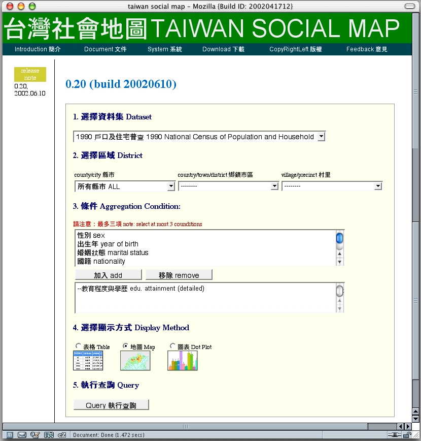
Figure B: The Main Menu Page Where A User Selects The Dataset, Aggregate Condition, and Display Method.
The following diagram provides an overview of the current system. The system has two main parts: One that aggregates from the census dataset a selected district population profile (e.g., the population profile in Nangang district, grouped by marital status, nationality, and gender), and one that assembles from a map database a selected district map. The first results in an XML file with a generic tabulation DTD designed by us. The second results in a SVG file representing the district map. The two results are further combined by two XSLT programs to produce an HTML file, with associated SVG and ECMAscript files, for ready display and exploration in a Web browser.

Figure C: A System Components Diagram of Taiwan Social Map System.
Note that the raw census dataset (in plain text format) and the raw district map (in ArcView format) were pre-processed and stored in a RDBS for easy access. Also notice that, after the pre-processing, the aggregation of population profiles and the assemble of district maps are driven by user queries and performed online. The pre-aggregation step extracts from the census database the population profiles for each of the 7,738 villages and precincts. Each profile is grouped by the most used 20 personal attributes: Gender, year-of-birth, marital status, nationality, education status, educational attainment, and health condition, etc. The pre-aggregation allows a population profile of a particular district, grouped by a particular set of personal attributes, to be quickly generated from the pre-aggregated profiles without the need to go back to the entire census RDBS for aggregation.
They are many graphical methods for visualizing a given population dataset. Some methods are better than the others in conveying the information in the dataset. Good data graphics are often clear and concise, and they invite viewers to make closer examinations at the displayed data. We have followed closely several recommended guidelines in our designs of the data graphics [3]. Our data graphics are not fancy -- they are not even very colorful! -- and do not use many SVG features.
We do depend, heavily, SVG's scripting ability. All the SVG documents we generate contain script elements in ECMAscript so that users can explore the data graphs interactively. Graphic elements to control the user interface (button, menu bar, etc.) are written in SVG as well. These control elements are designed to be visually concise and intuitive to use. All text in the generated data graphics are expressed in Chinese and English simultaneously. This helps increase the system's utilization among non-Chinese users; it also eliminates our need to generate two versions of the same graph just for the two languages. Since XML, hence SVG, is unicode-based this is not a problem except that some users may not have Chinese fonts properly installed at their local environments (more on this in Section 6.3). We now illustrate our design with the following three examples.
Figure D is a dot plot showing the composition of the population in the 18 Precincts of the Nangang district of Taibei City. The composition is calculated by aggregating the census data of each precinct over two census fields: nationality (either citizen or non-citizen) and gender (either male or female). The dot plot is used to show the precinct's population as the composition of all 4 possible combinations: citizen/male, citizen/female, non-citizen/male, and non-citizen/female. Currently only the dots for the citizen/male and non-citizen/male combinations are activated. As we can see on the plot, Jhongyan Precinct has most of the non-citizen/male population in Nangang District. This is not a surprise as Jhongyan Precinct is where Academia Sinica is located and Academia Sinica do have a sizable community of foreign researchers. Click on the image to access the live HTML document and to play with the plot by yourself.
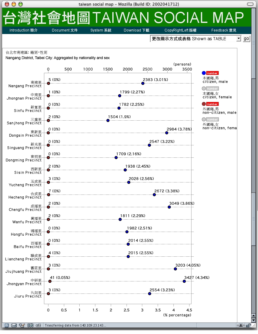
Figure D: A Dot Plot Showing The Composition of Population in Nangang District, Taipei City..
At the upper right corner of the dot plot, there are the 4 keys (i.e., the 4 different kinds of dots) used in the plot. The dots are plotted on the graph if its key is activated (clicked upon) by the users. An activated key can also be inactivated by another click. The user can choose to see the precise number (and percentage) of the dotted populations by clicking upon the keys' associated ``number plates'' at their right. For example, in Figure D, the numbers for male citizens in all 19 precincts are shown, so are the numbers for male non-citizens. Note that, because the later populations are all very small, it is crucial that their numbers can be displayed so that meaningful comparisons. can be made. On the top horizontal scale line the tick mark labels are in the unit of person. On the lower scale line the tick mark labels are expressed as the percentage within the entire population in the Nangang District (which consists of the 19 precincts be plotted).
The dot plot in Figure D embodies several good designs: bilingual text labels, user-clickable keys, optionally displayed numbers, as well as two horizontal scale lines expressed in two different units. All these can be implemented in simple SVG elements with SVG's builtin scripting ability.
We use dot plots in stead of the popular ``pie charts'' or ``bar charts'' in our display of population composition for several reasons. When compared to a bar chart, a dot plot is much more economical in its usage of display space. When compared to pie charts, dot plots can accommodate clickable keys easily while pie charts do not. Dot plots also allow easy comparisons of the scales of (and the order among) the ``dots'' either within a precinct or across all precincts. On the other hand, pie charts express scales as the surface areas of pie slides. For a pie with many slides, which is the case in population composition because there can be many combinations, the scales are difficult to estimated and to compared with one another.
Figure E is an administration district map of the Nangang District, Taibei City. The map is colorized according to the populations in its 19 precincts. The color keys are at the right of the map. Each of the 16 color keys represents a certain range of population. Each range is within a pair of adjacent multiples of the 500 quanta. The minimal range is from 500 (1 quanta) to 1,000 (2 quanta), and the maximal range is from 8,000 (16 quanta) to 8,500 (17 quanta). Any region in the map can be activated (by user clicking) to display more information about the region. For example, Jhongyan Precinct (second from the bottom in the Districts list at the lower right of the figure) is activated to reveal its population statistics (shown as Districts information at the lower left of the figure). We learn that, for example, Jhongyan Precinct has as many female foreigners as male foreigners. Click on the image to access the live HTML document and to play with the map by yourself.
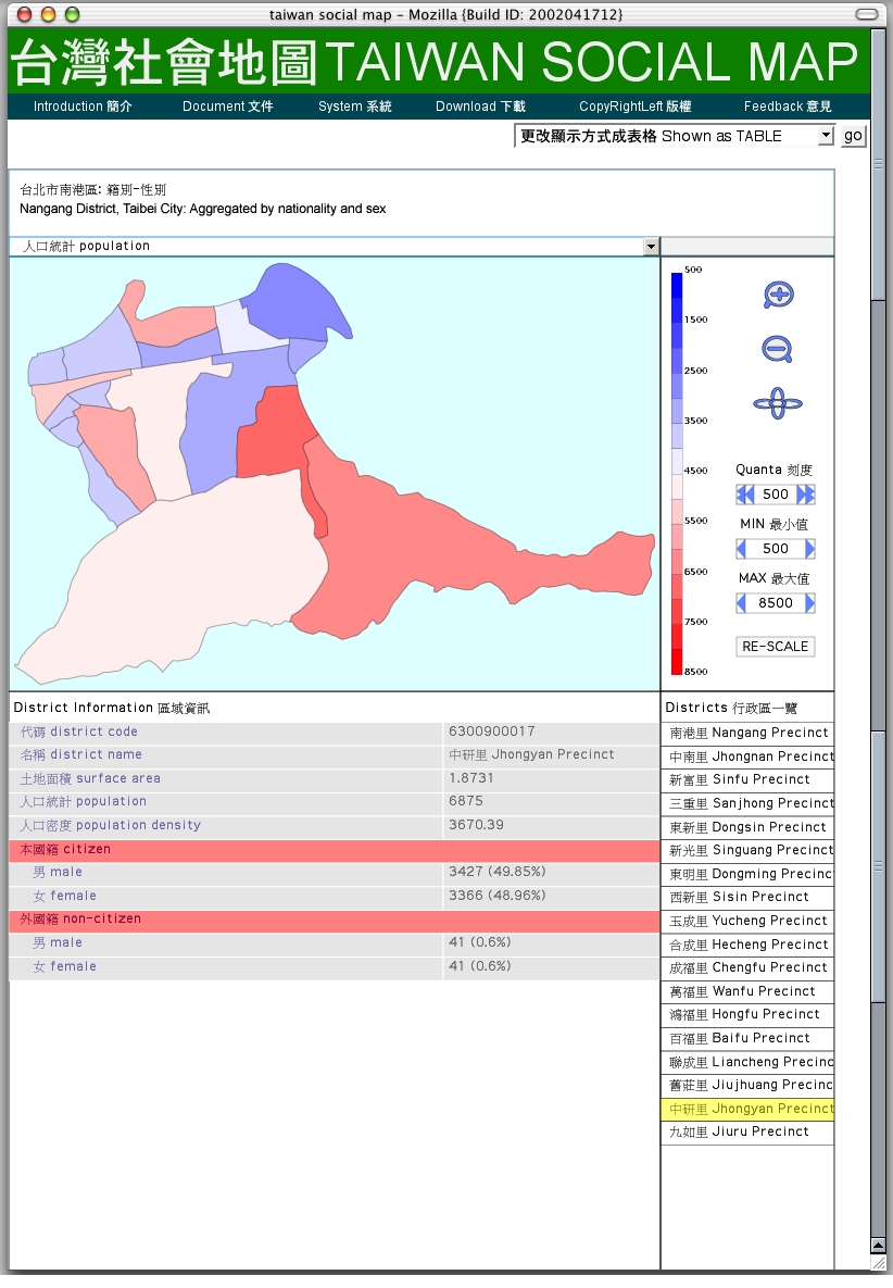
Figure E: A Geographic population map of the Nangang District, Taibei City.
Figure E embodies several design decisions. First, the color keys are drawn from a simple blue-to-red color scale. Hence, the blue precincts are easily percepted to be less populated than the medianly populated precincts (colored in white in Figure E), and the red precincts percepted to be the more populated ones. If the color scale was to use the ``rainbow'' encoding, we would have some difficulty in separating the less populated precincts from the more populated ones.
Second, the quanta of the color scale, as well as the minimal and maximal values of the scale, are all user-adjustable. This is a big help when we want to compare several population maps at the same time. We just let the maps to agree to a set of quanta, the minimum value, and the maximum value. As an example, the population map of the Neihu District, Taibei City, in Figure F uses the same set of scale values as in Figure E. The two population maps are easily comparable to each other as all the used colors retain their meaning across the two maps.
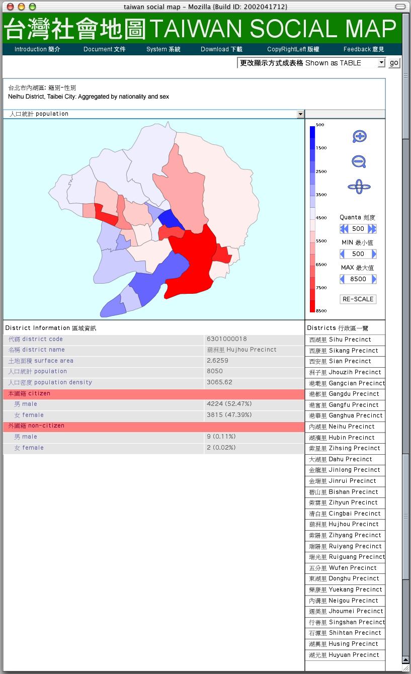
Figure F: A Geographic population map of the Neihu District, Taibei City.
We also experiment with tree maps with low aspect ratios, in particular squarified tree maps [4], to visualize hierarchical categorizations of population. Figure G is a squarified tree map of the distribution of aboriginal population in Taiwan (the numbers are extracted from the 2000 census dataset). Each rectangle in the tree map represents a particular population, and the rectangle size is proportional to the population size. The division of the entire tree map area, hence the categorization of population, is hierarchical. In Figure G, we first divide the entire aboriginal population by their tribes (Amis, Atayal, etc.), then with each tribe we divide its population by the counties/cities of its people's residences. Click on the image to access the live HTML document and to play with the map by yourself.
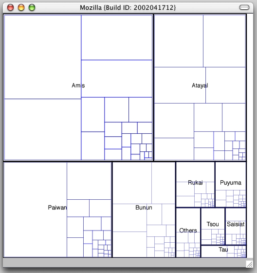
Figure G: A Tree Map Showing The Distribution of Aboriginal Populations: First by Tribe, then by City/County.
With the tree map in Figure G, we can easily answer the following questions. What is the largest, or smallest, aboriginal tribe in Taiwan? Of a particular tribe, in what city/county do most of its people live? However, we cannot easily learn where do most of the entire aboriginal people live from the tree map in Figure G. To answer such question, we need to categorize the population first by city/county then by tribe.
There are many challenges in building a high-performance population mapping system for large census datasets, using only freely available software tools. We list in this section the lessons we learned, as well as the challenges we may continue to face, in building and extending the Taiwan Social Map system.
SVG provides more features than we can reasonably ask for. Implementing all the features in SVG is a major challenge. As a result, there are few SVG browser plug-ins, or, SVG-supporting browsers, to choose from. This is especially the case when one wants to build a Web-based system that is portable across different OSes and browsers. Right now, we are limited to use a particular implementation of SVG plug-in as it is the only one that is available in Linux, Mac OS X, and Windows, and can be used with the major browsers. As such, the limitations (or bugs) of this particular SVG implementation become our system's limitations.
We are also forced to put all client-side scripts in the generated SVG document. That is, the user browser is sent a single SVG document which includes the population map itself and all the GUI elements to control the map. We would rather like to script SVG objects from an enclosing XHTML document using XHTML elements and separate ECMAscripts. However, we cannot do this because it is not portable with the SVG plug-in we must use.
The RDBS we use, MySQL, can hardly perform online aggregation of 20 million records over unrestricted number of record attributes. This limitation prompted us to perform pre-aggregation of the census data over a fixed number of record attributes, and to allow only online aggregations that can be directly derived from the pre-aggregated data. Likewise, free XSLT processors (actually, all XML processors based on the DOM API) do not work well with large XML documents. This forced us to use a RDBS, instead of an XML document, to store the entire cleansed census dataset. Free XML data stores that can efficiently manage gigabyte-sized XML documents not yet exist.
XML, hence SVG, uses unicode (or, more precisely, ISO/IEC 10646). Many XML processors often assume the input XML documents are in UTF-8 encoding. The prevalent Chinese character set used in Taiwan, however, is a two-byte ``big5'' character set. To process Chinese characters properly in XML, we need to do both a big5-to-unicode conversion and a unicode-to-UTF-8 conversion.
Furthermore, fonts for Chinese characters are not necessarily available in all OSes/browsers or, if available, not accessible to the SVG plug-in we use. The SVG documents may need to instruct user browsers to download the Chinese fonts. This may not be portable and may take up much time.
Taiwan is yet to adapt a standardized way to romanize Chinese characters. Romanization refers to a systematic mapping from the Mandarin phoneme set to the English alphabet. In our system, we uniformally use the Tongyong romanization method in converting a Chinese name to its English name. As a result, the romanized names may not agree with the widely used English names. For example, Taipei, the widely used English name for the largest city in Taiwan, is now ``Taibei''. We have designed the current system in such a way that the romanization method is user-customizable.
Online data aggregation and visualization is only a small part in a population mapping system. We have yet to address issues of census data quality, survey codebooks, multiple socio-economic data sources, as well as personal privacy protection, among others, in building a successful system.
Vienna -- Social Patterns and Structures [5] is a classic example of SVG-based population maps. Our system differs the Vienna map in that ours is a 3-tier system: The presentation of data is separated from the preparation of data, and the preparation of data is again separated from the data source itself. We can easily modify the parts about online aggregation of population profiles, online assemble of district maps, and online preparation of presentation files, without seriously affecting one another. XML is the data exchange format that connects the three tiers. We also designed a generic tabulation DTD to structure population profiles so that presentation files for different population profiles can be uniformly generated using simple XSLT scripts.
Future work includes dealing with multiple census datasets (e.g., the 1980 and 2000 datasets) and with changing district maps (districts often merge and/or split over time).
We have named our current system Taiwan Social Map. We aim to gradually build up its collection of population datasets, as well as to improve its performance and usability. The web site is located at
http://quad.iis.sinica.edu.tw/~tsm/
http://tsm.iis.sinica.edu.tw/
Your comments and suggestions are most welcome.
[1] Jon Ferraiolo, editor. Scalable Vector Graphics (SVG) 1.0 Specification. W3C Recommendation. September 4, 2001.
[2] ESRI. ArcView 3.x.
[3] William S. Cleveland. The Elements of Graphing Data. Hobart Press, Summit, New Jersey, USA, 1994.
[4] Mark Bruls, Kees Huizing, and Jarke J. van Wijk. Squarified treemaps. In W. de Leeuw and R. van Liere, editors, Data Visualization 2000: Proceedings of the Joint Eurographics and IEEE TCVG Symposium on Visualization, pp. 33-42. Vienna, Austria, 2000. Springer.
[5] Andreas Neumann. Vienna -- Social Patterns and Structures.
(1) Red hat Linux OS. Available at http://www.redhat.com.
(2) Apache Web server. Available at http://httpd.apache.org.
(3) Mozilla Web browser. Available at http://www.mozilla.org.
(4) MySQL RDBS. Available at http://www.mysql.com.
(5) PHP script language. Available at http://www.php.net.
(6) Xalan-C++ XSLT processor. Available at http://xml.apache.org/xalan-c/index.html.
(7) Nedjo Rogers. shp2svg format converter. Available at http://www.carto.net/projects/shp2svg/.
Completed: June 11, 2002.
Updated: September 16, 2006 (The TSM site is now at http://tsm.iis.sinica.edu.tw/).